
Google’s “Agent-Friendly” Checklist Is Accessibility With a New Budget: The 2026 Playbook For Sites That Humans And AI Agents Can Use
Google’s agent-friendly UX checklist isn’t a new audit category—it’s accessibility fundamentals reframed for AI agents. That reframing changes who funds the work, how teams prioritize it, and why SMEs should run one combined audit that improves conversions, reduces UX regressions, and increases AI citation reliability.

In 2026, Google’s published guidance on “agent-friendly” websites is being treated like something new. It isn’t. It’s accessibility fundamentals—reintroduced with a different audience in mind: AI agents that browse, click, fill forms, and interpret pages visually.
That reframing matters because it changes what gets funded, what gets prioritized, and what actually ships. For most businesses, accessibility has too often been a compliance checkbox that lives in quarterly audits and never makes it into production. “Agent readiness” is arriving with growth-team urgency, SEO vendor weight, and a direct line to AI visibility conversations. Same work. More budget. Higher stakes.
This editorial is informed by the Search Engine Journal analysis Google’s Agent-Friendly Checklist Is The Accessibility Audit Restated. I’m building a broader, practical playbook for SMEs and agencies: what changed, why it matters, what can go wrong, and how to operationalize one combined audit that serves both human and machine visitors.
Concise summary (so you can act fast)
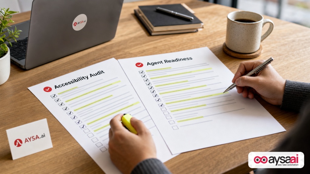
- Google’s “agent-friendly UX” checklist maps closely to established web accessibility practices. Don’t treat it like a separate audit category.
- The business change is budget and urgency. Accessibility now has a second buyer: AI visibility (AEO/GEO) and automation reliability.
- The operational change is cadence. Stop doing accessibility one quarter and “AI readiness” the next. Run one continuous combined audit and ship fixes monthly.
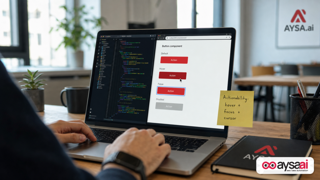
- The first fix I’d prioritize on most sites: restore strong actionability signals—semantic controls, visible state changes, reliable focus/hover/cursor cues—because both humans and agents rely on those signals to complete tasks.
- Where AYSA fits: Monitoring + change proposals + approval + execution—so your audit becomes deployed improvements instead of backlog noise.
Table of contents

- Why this matters now: accessibility just got a second buyer
- What changed (and what didn’t) in search and web operations
- What “agents” really are (in plain business terms)
- Google’s 7 agent-friendly rules, translated into business risk
- Why it’s basically WCAG: the convergence you can leverage
- The one fix to make first: make actionability unmistakable
- Run one combined audit: a practical checklist you can own
- SME scenarios: ecommerce, clinic, and local services
- What commonly breaks after updates (and why teams miss it)
- How to measure progress without invented metrics
- What agencies should change: from PDF audits to shipping systems
- Where AYSA fits: monitoring → proposals → approval → execution
- What to do next: a 30/60/90-day action plan
- Sources and further reading
Why this matters now: accessibility just got a second buyer
Accessibility didn’t become important in 2026. It has been important for decades. The difference is that the incentives finally align for more organizations.
Historically, accessibility work competes with:
- new features,
- brand refreshes,
- performance initiatives,
- growth experiments,
- and whatever the loudest stakeholder wants this sprint.
When accessibility is framed primarily as compliance or “nice to have,” it’s too easy for busy teams to push it out. Not because leaders are immoral—because they’re operating with limited time, limited engineering capacity, and a never-ending backlog.
Google publishing an “agent-friendly” checklist changes the internal conversation at thousands of businesses. It gives accessibility fundamentals a new justification that resonates with growth and product teams:
- AI-mediated discovery: If AI systems summarize, recommend, or cite sources, the sites that are easiest to interpret and navigate will be the most reliable to use.
- Automation as a user: Agents that browse like humans depend on the same signals that assistive technologies and keyboard users depend on.
- Vendor weight: Even when something is phrased as “consider following,” teams treat it as “this will matter” when it comes from the dominant search vendor.
My point of view: this is good news. Not because accessibility needs a growth excuse, but because the fastest path to better experiences is the path that gets budget, process ownership, and consistent execution. Agent-readiness language is a lever you can use to finally ship the accessibility work your site needed anyway.
What changed (and what didn’t) in search and web operations
What didn’t change: people still want fast, usable websites. They still want to buy, book, request quotes, get answers, and trust what they see.
What changed is the mix of visitors and intermediaries:
- Traditional SEO assumed a person searches, clicks, and navigates with human judgment and adaptability.
- AI Search and agentic browsing assumes that some portion of discovery, summarization, and task completion can be mediated by machines.
In practical terms, that means the web has more “users” now:
- Humans using a mouse
- Humans using keyboards (including power users and accessibility users)
- Humans using screen readers and other assistive tech
- Humans on mobile dealing with small tap targets and overlays
- Agents that rely on semantic structure, visual cues, and stable UI patterns to complete tasks
If you already invested in accessibility, you’re not starting from zero. In many cases, you’re closer than competitors who spent the last three years only on content volume or link acquisition.
What “agents” really are (in plain business terms)
Don’t get stuck in sci-fi definitions. In business terms, an “agent” is simply software that attempts to:
- navigate a website like a user would,
- find information,
- complete a task (book, buy, submit, configure),
- and determine success based on what the interface shows.
That last part is the key: agents often need observable cues. They can’t rely on “it probably worked.” They need a visible confirmation, a changed state, a stable layout, and predictable interactive elements.
It’s tempting to treat this like “optimize for bots.” That’s the wrong framing. The correct framing is: optimize for reliability. When your site behaves consistently and communicates clearly, it’s better for everyone.
Google’s 7 agent-friendly rules, translated into business risk
The SEJ analysis lists Google’s seven “agent-friendly” rules. I’m not copying the original text; I’m translating each principle into how it breaks revenue journeys and why it shows up as “mysterious” performance decline.
Rule 1: Reflect every action in the interface
What it means: Every click or submission should produce a visible response: loading state, confirmation, error message, changed button state, updated cart count, expanded panel, etc.
Why businesses should care: A silent action is indistinguishable from a broken action. For humans, it creates uncertainty and double-clicks. For agents, it can create loops or abandonment.
Common failure modes:
- AJAX form submissions without a success message
- “Add to cart” that doesn’t change the cart count or show a confirmation
- Buttons that trigger background actions but don’t visually change
Business outcome: lower completion rate, more support tickets (“I submitted but never heard back”), and wasted paid traffic.
Rule 2: Keep the layout stable
What it means: Primary actions, navigation, and key UI components shouldn’t jump around between templates, categories, or page types.
Why businesses should care: Stability isn’t “design purity.” It’s task efficiency. People build a mental model of your interface. Agents rely on that model even more.
Common failure modes:
- “Add to cart” appears Above The Fold on one product template and below on another
- Filters switch sides or change style across categories
- Location pages use different headings and navigation than service pages
Business outcome: lower conversion and higher bounce, especially for returning visitors who expected consistency.
Rule 3: Avoid overlays that block interaction (even transparent ones)
What it means: Don’t let cookie banners, chat widgets, popups, sticky headers, or accidental layers sit on top of critical buttons or fields. Even invisible overlays can block clicks.
Why businesses should care: This is one of the most common “everything is fine on my laptop” problems. On a different device width, the overlay blocks the CTA and your funnel quietly breaks.
Common failure modes:
- Cookie consent bar overlapping checkout buttons on mobile
- Chat widget covering the submit button on form pages
- Transparent div with a high z-index blocking taps
Business outcome: sudden drop in conversions without an obvious analytics explanation.
Rule 4: Use semantic HTML (or correctly emulate it)
What it means: A button should be a <button>. A link should be an <a>. Headings should form a meaningful structure. If you create custom interactive elements, you must supply the equivalent semantics and keyboard behavior.
Why businesses should care: Semantic structure is how browsers, assistive technologies, and automation systems understand the page. It also makes your site easier to maintain and test.
Common failure modes:
- Clickable
<div>elements without roles and keyboard support - Headings used for styling, not structure
- Interactive elements that cannot be reached via keyboard
Business outcome: fragile UX, QA headaches, and avoidable customer friction.
Rule 5: Use strong “actionability” cues (including cursor: pointer)
What it means: Interactive elements should look interactive. Think cursor changes, hover styles, focus indicators, and consistent button styling.
Why businesses should care: When users can’t tell what’s clickable, they hesitate. When they hesitate, conversions fall. When an agent can’t tell what’s actionable, tasks fail.
The SEJ analysis highlights a practical issue: a framework default (in that example, Tailwind v4) can remove cues across an entire site unless you explicitly restore base styles. The broader lesson is bigger than Tailwind: design systems and CSS resets can quietly delete your actionability signals.
Rule 6: Tie labels to form fields
What it means: Labels should be programmatically associated with inputs (e.g., via for and matching id). Placeholder text isn’t a label. Visual proximity isn’t enough.
Why businesses should care: Forms are where revenue happens: leads, checkouts, bookings, quote requests. If your form isn’t properly labeled, completion drops and errors rise—especially for mobile users and accessibility users.
Common failure modes:
- Inputs with only placeholders
- Labels not connected to inputs
- Error messages that aren’t linked to the field that failed
Rule 7: Make interactive elements large enough
What it means: Tap targets shouldn’t be tiny. Spacing matters. Icons used as controls should be large enough to hit on mobile and distinguishable for visual analysis.
Why businesses should care: This is a classic source of mobile friction. You don’t see it in desktop QA, but you feel it in mobile conversion.
Common failure modes:
- Small “x” close buttons on modals
- Tiny quantity controls in carts
- Dense navigation items with little spacing
Why it’s basically WCAG: the convergence you can leverage
If you want a durable foundation, you don’t chase every vendor checklist. You map it to standards. That’s why the most important line in the SEJ analysis is the underlying claim: these rules map to existing accessibility recommendations.
The most authoritative place to start for accessibility guidance is the W3C Web Accessibility Initiative and WCAG:
For practical component-level implementation guidance (especially when you’re building custom UI), W3C’s ARIA Authoring Practices Guide is a reputable reference:
Here’s the business benefit of understanding this convergence: you can build one program. Not an “AI program” and an “accessibility program” that fight for time. One program that produces:
- better usability,
- better conversion,
- lower support burden,
- and higher reliability for any automation or AI system that needs to interpret your site.
That’s what I mean by compounding returns. One investment, multiple payoffs.
The one fix to make first: make actionability unmistakable
If you force me to prioritize one area across most SMEs, I start with actionability—the signals that tell a user (or an agent): “this is clickable,” and “your click worked.”
Why? Because actionability failures usually sit right on the money path:
- Lead forms
- Checkout flows
- Booking experiences
- Quote requests
- Cart and account interactions
And actionability is fragile. It’s not “set once and forget.” It breaks when:
- a CSS reset changes default cursor or focus outlines,
- a design system update removes hover states,
- a component library replacement swaps semantic buttons for divs,
- a new overlay is introduced without testing key breakpoints.
What to do first (practical checklist):
- Primary buttons: confirm they are semantic
<button>elements where appropriate and show visible hover, focus, active, disabled, and loading states. - Links: ensure links look like links (or at least have consistent styling) and aren’t disguised as plain text without cues.
- Keyboard navigation: tab through the page. If you can’t see where focus is, you have an actionability problem.
- Form submission feedback: submit a form and confirm a visible success or error state that is obvious and persistent enough to notice.
- Mobile tap targets: try to complete the key conversion action on a small phone screen without “precision tapping.”
One more opinionated note: some teams hide focus outlines because they think it looks “ugly.” That’s a design maturity problem, not an accessibility problem. You can design branded focus states that look premium and still communicate clearly.
Run one combined audit: a practical checklist you can own
Most businesses don’t need two separate audit calendars. They need one operating system for quality: accessibility + agent readiness + conversion reliability.
Here’s a combined audit approach that SMEs can actually run without turning into an enterprise bureaucracy.
Step 1: Inventory the journeys that pay your bills
Pick the top 3–5 journeys that directly produce revenue or leads. Examples:
- Ecommerce: product page → add to cart → checkout
- Clinic: service page → appointment form → confirmation
- Local services: service page → quote request form → call tracking or confirmation
- SaaS: pricing page → demo request → calendar booking
- Hotel: room page → availability search → booking flow
Don’t start with your entire site. Start where failures matter.
Step 2: Audit by template, not by URL
One of the reasons audits become overwhelming is that teams think in URLs. That’s not how websites are built. Websites are built with templates and components.
A template-first audit means you test:
- one product page template, not 5,000 products;
- one location page template, not 80 locations;
- one blog article template, not 300 posts.
When you fix the template, you fix the entire class of pages. That’s how you get leverage.
Step 3: Use one checklist with two audiences in mind
Create a single checklist where each item has two columns:
- Human impact (conversion, usability, accessibility)
- Agent impact (ability to interpret, navigate, and confirm outcomes)
Example items to include:
- Semantic HTML: buttons/links/headings used correctly
- Visible action outcomes (loading/success/error)
- Stable placement of key CTAs and navigation
- No overlays blocking key actions at common breakpoints
- Label-to-input associations and clear error messaging
- Tap target size and spacing on mobile
- Visible focus states for keyboard navigation
Step 4: Adopt a shipping cadence, not an audit cadence
Quarterly audits are where good intentions go to die.
Instead:
- Continuous monitoring: watch for regressions and breakpoints that affect key journeys.
- Monthly shipping: schedule a recurring “quality release” where the goal is to ship a small set of high-impact fixes.
- Release notes: document what changed and why. This makes the program sustainable.
This is also where many SMEs struggle: they can identify issues, but they can’t execute consistently. That’s exactly the gap AYSA is designed to close.
SME scenarios: what this looks like in the real world
Let’s make this tangible. Here are three realistic scenarios that show why “agent-friendly” is not theoretical—and why it’s the same audit as accessibility.
Scenario 1: Ecommerce brand with a “silent cart” problem
An ecommerce store redesigns product pages and removes the mini-cart animation and confirmation toast because “it felt distracting.” The add-to-cart action still works, but nothing changes visually unless the user opens the cart icon.
What humans do: Some click again. Some leave. Some assume it’s broken. Support gets messages like “I tried to add it but it didn’t work.”
What an agent does: Without a visible state change, the agent may assume the click failed and either retry (causing unexpected quantities) or abandon the attempt.
The fix: Add a visible state change that confirms success (cart count update, button state change, toast). That’s classic UX and accessibility-friendly feedback. It’s also agent-friendly.
Scenario 2: Clinic appointment form that “looks labeled” but isn’t
A clinic uses a form builder that visually places labels above fields, but the underlying HTML doesn’t programmatically associate the label with the input.
What humans do: Many can still fill it out, but completion drops for keyboard and screen reader users. Error handling is often unclear.
What an agent does: It may not reliably map which label corresponds to which input. The agent fails to complete the form, even when the form looks perfectly fine to a human.
The fix: Proper label associations (label for + input id), clear required-field indicators, and field-linked errors. That’s WCAG-aligned. It’s also agent-ready.
Scenario 3: Local service business with an overlay collision
A local HVAC site adds a chat widget to improve lead capture. On certain mobile breakpoints, the chat bubble covers the “Request a quote” button—only on service pages, not on the homepage.
What humans do: Some scroll and give up. Some call instead. Some bounce. Your analytics shows a sudden conversion drop, but it’s not obvious why.
What an agent does: It tries to click the button, but the overlay blocks it. Task fails.
The fix: Ensure overlays avoid covering primary CTAs, especially on small screens. This is basic UX hygiene, and it’s a major agent-readiness factor.
What commonly breaks after updates (and why teams miss it)
The SEJ analysis includes a key operational warning: upgrades can silently break one of these “agent-friendly” rules across an entire site. Even if you don’t use the same stack, you should treat this as a general lesson.
Why teams miss these issues:
- Happy-path testing: teams test on desktop, logged in, with a mouse, on a fast connection.
- Template blind spots: homepage looks fine; category pages or forms break.
- Breakpoints not covered: UI works at 1440px but fails at 375px.
- Design system drift: one component gets updated, and suddenly 200 buttons behave differently.
- “It’s just CSS” bias: teams underestimate how often CSS changes break usability and conversion.
Where regressions typically appear:
- CSS resets: focus outlines removed, cursor behavior changed, default button styling normalized away.
- Component libraries: semantic
<button>swapped for divs for styling convenience. - Third-party scripts: cookie banners, chat widgets, A/B testing overlays, personalization layers.
- Performance optimizations: deferred rendering or hydration issues that alter layout stability.
- CMS/plugin updates: markup changes in forms, navigation, or interactive widgets.
This is why I’m pushing “stop doing separate audits” so hard. The real problem is not knowing what to fix; it’s that websites are living systems. They regress. If you don’t monitor and ship continuously, your “pass” becomes a “fail” the next time someone updates a theme.
How to measure progress (without pretending we can see inside AI systems)
We need to be careful here: the SEJ analysis correctly notes that the agent-friendly guidance is framed as suggestions and doesn’t explicitly tie to ranking. So don’t invent metrics or claim guaranteed AI traffic gains.
Instead, measure what you can measure reliably as an SME:
1) Journey completion metrics
- Form completion rate (start → submit)
- Checkout completion rate (cart → payment → confirmation)
- Booking completion rate (availability search → confirmation)
If actionability cues, labels, overlays, or tap targets are broken, these metrics usually show it first.
2) Support and qualitative signals
- Support tickets: “button doesn’t work,” “form won’t submit,” “can’t click,” “page jumped”
- Sales team notes: “leads say the form was confusing”
- User recordings (where privacy-appropriate)
These are often the earliest indicators of problems that audits miss.
3) Correlate regressions with releases
When you ship updates, track whether a conversion metric dipped immediately afterward. Many “mysterious” declines are simply regressions introduced by a release that wasn’t tested across key breakpoints.
4) Track AI search visibility as a trend, not as a promise
AI visibility measurement is evolving. Rather than claiming a direct causal line from “cursor pointer” to “rankings,” track your overall presence and citations across AI experiences as a trend line and interpret changes cautiously.
If you want a practical framework for this broader visibility work, start with AYSA’s AI Search Visibility resources and tooling.
What agencies should change: from PDF audits to shipping systems
If you’re an agency, this is a packaging and delivery moment.
What many agencies sell today:
- Technical SEO audits
- Accessibility audits
- “AI readiness” audits
What clients often experience:
- a document,
- a backlog,
- and little actual change because the client’s engineering team is busy.
In the agent-friendly era, that model gets less defensible. Why? Because:
- the same underlying issues keep returning (regressions),
- AI visibility is not a one-off project,
- and outcomes depend on execution, not diagnosis.
The agency play for 2026: combine the audits, then attach an execution system.
A modern deliverable looks like:
- One combined backlog scored by business impact + implementation effort
- Clear acceptance criteria (what “fixed” means)
- Monthly shipping with QA across templates and breakpoints
- Monitoring so you catch what breaks after updates
This is where “approved execution” is more than a product feature—it’s an operating model. The organizations that win won’t be the ones who write the most audits; they’ll be the ones who ship improvements reliably without breaking the site.
Where AYSA fits: monitoring → proposals → approval → execution
Most SEO tooling is built around reporting. Reporting is necessary, but it’s not sufficient—especially now that technical UX quality is tied to both human usability and agent reliability.
AYSA is built as an execution system:
- Monitor: keep watch for the kinds of regressions that impact search and AI visibility foundations. See AYSA Monitoring.
- Prepare: translate findings into concrete change proposals, not vague advice.
- Approve: keep business owners and teams in control—nothing ships without sign-off.
- Execute: implement accepted changes so fixes don’t die in backlog.
That model matters for accessibility/agent-readiness work because many of the highest-impact improvements are small but widespread:
- restoring focus states across a component library,
- fixing label associations on key forms,
- removing overlay collisions at specific breakpoints,
- standardizing CTA placement across templates,
- tightening semantic HTML usage in navigation and interactive elements.
If you want to see how AYSA approaches the broader AI visibility problem set (not just technical UX), start here:
One more practical point: accessibility changes can affect design and conversion. The “approved” part is not bureaucracy—it’s safety. You want a workflow that allows preview, QA, and deliberate rollout.
What to do next: a 30/60/90-day action plan
Here’s a concrete path that a typical SME can execute without getting trapped in an endless audit loop.
Days 1–30: Stabilize the money paths
- Pick your top 3 journeys (checkout, lead form, booking, demo request).
- Run a template-first audit on those pages focused on the seven principles: visible state changes, stable layout, no blocking overlays, semantic controls, actionability cues, label associations, tap target size.
- Fix the obvious actionability gaps first: visible focus, hover, clear button styles, and feedback after click/submit.
- Test on mobile breakpoints where overlays and small targets usually fail.
Days 31–60: Build the combined backlog and shipping cadence
- Create one combined backlog labeled “Accessibility + Agent Readiness.” No duplicate lists.
- Score each item by revenue impact + ease of fix.
- Schedule a monthly quality release where you ship the top 3–10 items (depending on capacity).
- Document acceptance criteria so “fixed” is unambiguous.
Days 61–90: Make it sustainable with monitoring and approvals
- Implement monitoring for regressions in key templates and breakpoints. This is where issues get caught early.
- Adopt an approval workflow so fixes ship safely and predictably.
- Train your team (or agency) to think in templates/components and to treat UI changes as conversion-critical, not cosmetic.
Sources and further reading
- Research input (SEJ): Google’s Agent-Friendly Checklist Is The Accessibility Audit Restated
- W3C Web Accessibility Initiative (WAI): W3C Web Accessibility Initiative
- WCAG overview: WCAG Accessibility Guidelines
- WCAG 2.2 (official recommendation): WCAG 2.2 Specification
- WAI-ARIA Authoring Practices Guide: ARIA Authoring Practices Guide
Final word: one audit, two visitor classes
If you take only one idea from this editorial, let it be this: stop running accessibility and agent-readiness audits as separate initiatives. They’re the same audit in practice, and the same work is now being demanded by more stakeholders.
When you build a site that communicates actions clearly, stays stable, uses semantic structure, labels inputs correctly, avoids blocking overlays, and respects tap targets, you don’t just “comply.” You become easier to navigate for humans and more reliable for machines. In a web where AI systems increasingly mediate discovery and action, reliability is the new growth advantage.
And reliability isn’t a quarterly PDF. It’s an execution habit.
Continue the AI search topic inside AYSA.
Use these pages to connect the article with AI SEO tools, AI visibility monitoring, AI Overviews and approved website execution.
Turn this topic into a website action plan.
Use these AYSA hubs to move from reading to technical fixes, AI visibility monitoring, research, glossary context and approval-first SEO execution.